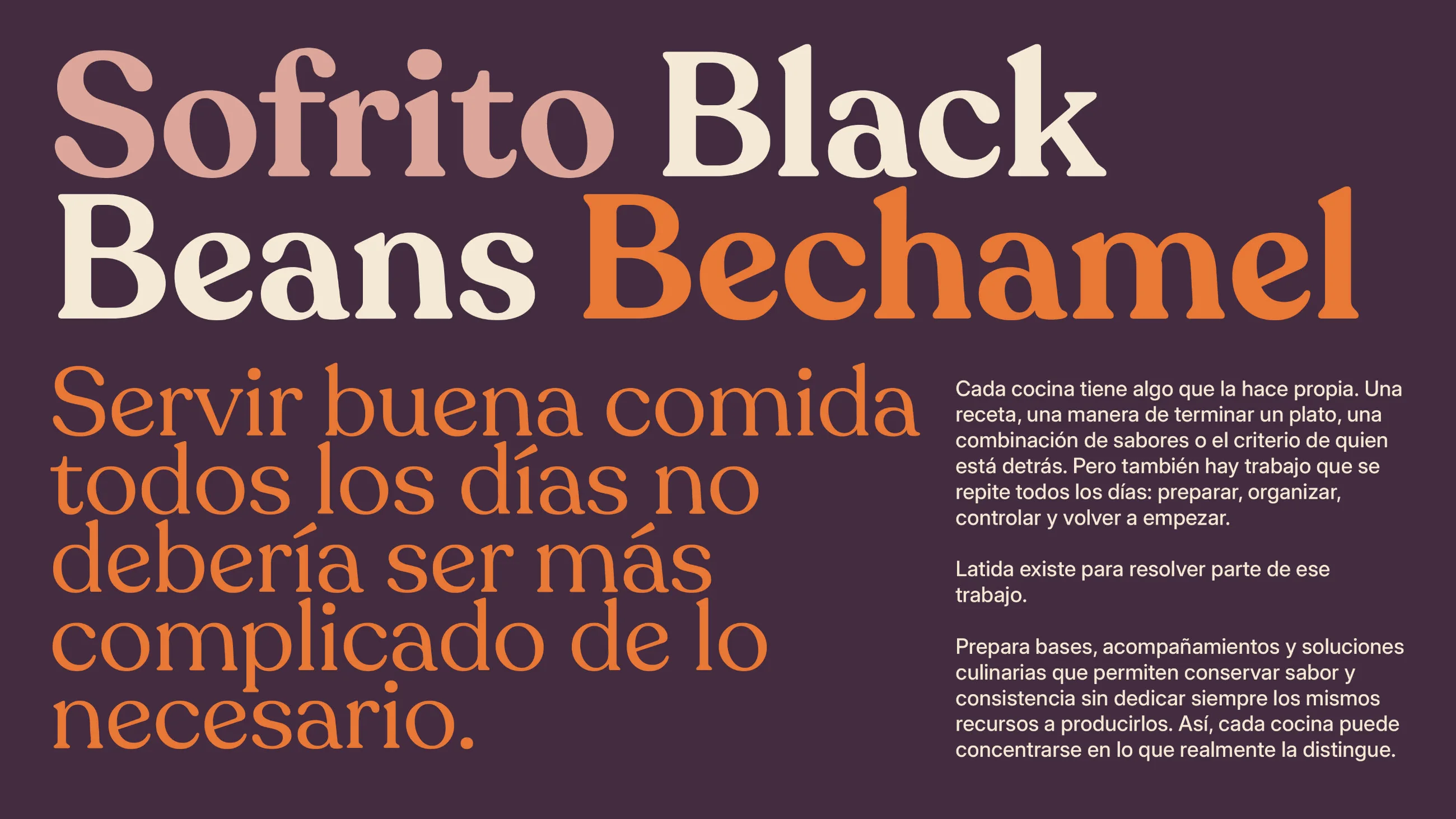
Typeface

The official typography package includes Recoleta and Inter, with font files and separate usage samples for headlines, secondary headings, and paragraphs. Use the fonts in Assets Latida > 02 Tipografía; do not substitute similar-looking typefaces.

Primary
Recoleta
ABCDEFGHIJKLMNOPQRSTUVWXYZ
abcdefghijklmnopqrstuvwxyz
0123456789
Download the fontFont
a
Regular
Secondary
Inter
ABCDEFGHIJKLMNOPQRSTUVWXYZ
abcdefghijklmnopqrstuvwxyz
0123456789
Classification
Neo-grotesque
Get it on Google FontsGoogle Fonts
a
Regular
Try it

Test how Recoleta and Inter perform in headlines, subheadings, and functional copy. For weight and proportion decisions, refer to the supplied Títulos, Títulos secundarios, and Párrafos reference documents in Dropbox.

Size
Sphinx of black quartz, judge my vow.
Hierarchy

The hierarchy must clearly separate expressive typography from operational information. Consult the three type-weight reference documents and use only combinations approved in the supplied system. Exact sizes for each format must be derived from the master artwork, not from template defaults.

DisplayRecoleta·Regular64pxLeading1Tracking−2.5%
Say the big thing
HeadingRecoleta·Regular40pxLeading1.1Tracking−1.5%
A headline that leads the page
SubheadingInter·Regular24pxLeading1.25Tracking0%
A subheading sets up what follows
BodyInter·Regular16pxLeading1.4Tracking0%
Body text is for reading. Keep it at a comfortable size with generous spacing, and let the headings above it do the shouting.
CaptionInter·Regular12pxLeading1.4Tracking1%
Captions, labels and small print
Updated Nov 16, 2026